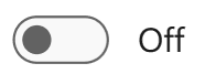
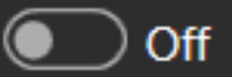
When IsOn is False, the toggle displays the OffContent. It is inactive, and the thumb is aligned to the left.
When IsOn is True, the toggle displays the OnContent and is active, highlighted with accent colors.
| Themes | Off State | On State |
| Default |
|
|
| Microsoft 365 Dark |
|
 |
| Material theme |  |
|
Toggling the switch triggers a smooth animation that helps users understand the state change and improves user experience.
